Creating the Photographer User Experience in a Portal
A place where emerging photographers from underrepresented communities can share their images and stories, see their statistics, get paid for their work, and access different opportunities.
Overview
Scopio is an image storytelling platform and marketplace, that I cofounded, where photographers and artists can share images from underrepresented identities and get paid for their images.
In 2019, after 2 years of success with over 143,000 images submitting via our website, we decided to create a portal so photographers can login and manage their accounts, as well as attract new photographers to our community. I led the engineering team, using the agile methodology, to develop and onboard it to over 9,000 of our photographer community.
AI on the Backend System
In parallel, I designed and, with the engineering team, built a backend system that our team can log into in order to curate the images that were submitted to the portal. To process the influx of images we’ve been receiving, the engineering team and I implemented a system of machine learning through natural language processing and computer vision to process the new images. This system was able to analyze the content of the images and tag them with keywords and categories. The images are first passed through our automated system, then to a human curator to correct any mistakes that the machine might have made.
Process
User Research
I conducted 23 interviews with photographers from different countries, ethnicities, genders, subject matters, and skill levels. The goal was to learn from them about how I could design a photographer portal with new and improved features, like image submissions, the payment system, statistics, and the opportunities section. They gave me diverse feedback on our current submission and payment processes that guided my process in designing a basic MVP. With it, I conducted user testing sessions and got a sense of how the target users were able to interact with the new product and what I can improve.
Key Takeaways
Frustrated with existing photo submission services, because most of their photos don’t get approved
Submitting images through the website was difficult and hard to navigate
Without a profile, they don’t have visibility over their earnings and photo submission metrics
Wanted to have control over how they are tagging and titling their images
Would like more access to Scopio’s support and customer service
User Journey Mapping
The most important feature in the portal was the upload feature. I wanted to design it as seamless as possible to eliminate friction for the photographers contributing their photos. Based on user feedback I received, I mapped out the user journey.
Wireframing & Prototyping
After gaining confidence of the target user’s needs and goals within the portal, and mapping out the user journey, I was able to visualize the key features. So I created wireframes for the photo upload flow, the photo approval flow, user profile section, photographer payouts, and opportunities and perks.
Deliverables
Photo Upload & Statistics
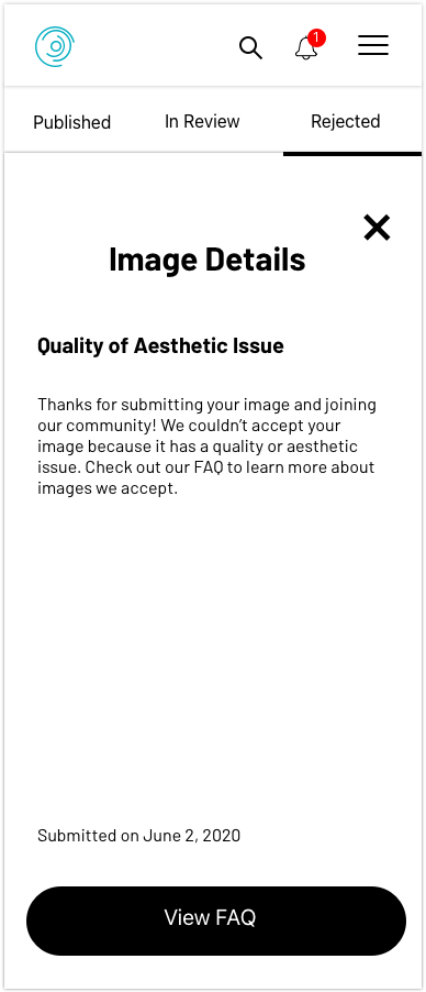
This is the most important section of the portal, where photographers can upload their photos to the portal and view their statistics. They can see the number of the images that were published, in review by our curation team, and the ones that weren’t accepted. The statistics include total downloads, views, and saves. The sorting feature allows them to sort by most recent, as well as most downloaded, viewed, and saved by customers buying the photos. When they click on an image, they can see image details, like metadata and individual statistics.
Payouts
Photographers can check out the payouts section to see their earnings from the photos that were downloaded from Scopio customers. They can connect their PayPal or crypto wallet to get paid. They also need to add their tax information before receiving their earnings.
Opportunities & Perks
There’s a section in the portal where photographers can check out opportunities for various photography and art projects that come from companies we partner with. They apply and, based on their work, are accepted to join the project. There are also many perks and discounts on courses, equipment, and digital products that come from our partnerships.
UI Components
User Engagement Metrics
I worked with the engineering team to set up a set of metrics that will measure user engagement of the photographers. It gave us a birds-eye view of app’s success with our current user base, and allowed us to measure daily retention, new users, number of photos submitted, login rates, and the speed of photos reviewed and published by our team with the help of our machine learning algorithm. After the launched the portal, we could see an big uptick in the number login rate, number of photos submitted, and new photographers who joined the platform.
I had previous designed and launched a separate portal for our customers, so we were able to observe photographer and customer login rates and their fluctuations.
Feedback & Insights
After launching the portal, I wanted to get feedback from photographers on how the user experience has been for them, so I sent our a survey and received 249 responses. Here are some of the questions asked and information gathered for future iterations.


