Designing a Pioneering Social App for Artists
An app for artists to share their images and stories, and connect with a community of like minded people.
Overview
Scopio is an image storytelling platform and marketplace, that I cofounded, where photographers and artists can directly submit images and sell them. The company’s mission is to elevate human stories told by people from underrepresented identities, challenge visual stereotypes, and give opportunities to emerging photographers and artists to get paid for their images and get hired.
In 2022, after we have seen 3 years of growth with the photographer contributor portal, we decided to create an app for photographers and artists to share their images and stories, discover, and connect with like minded artists. We wanted the app to reflect the current needs of gen Z artists and different from anything we’ve done before and anything that exists in the stock photo and photojournalism industry. It needed to have a social component where artists can connect with each other and form a stronger community. I led a team of designers to conceptualize and design of a mobile app that would meet these needs.
Process
User Interviews
To gather this quantitative and qualitative data, I created a user research plan as well as strategic and tactical goals. I sent out a survey to our artist community to gather information on who would be open to be interviewed, and we received 363 responses. I conducted 12 hour-long interviews with photographers and artists of varying backgrounds, login frequencies, number of photos submitted, along with usability testing sessions of our contributor portal.
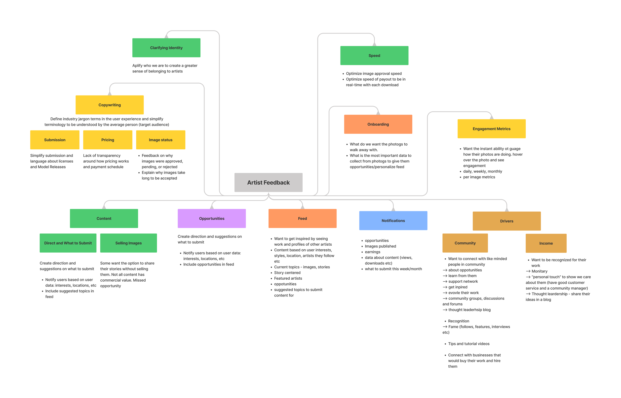
Biggest Insights from Artists
A desire to have more guidance and direction from Scopio about trending images and what type of content customers are looking for.
A desire to discover other artists and built a community
A desire to have more clarity on Scopio’s payment process
A desire to get more work opportunities in their field
User Journey Mapping
After interviewing user groups and collecting quantitative and qualitative data, we mapped the user journey in the app in order to define the priority features that would add value to the main user groups.
Wireframes
The team developed wireframes to illustrate the user journey before building the eventual MVP.
App Features
After several rounds of interviews, and the insights I received, I created a plan to design the features in the app. They include the following.
Onboarding
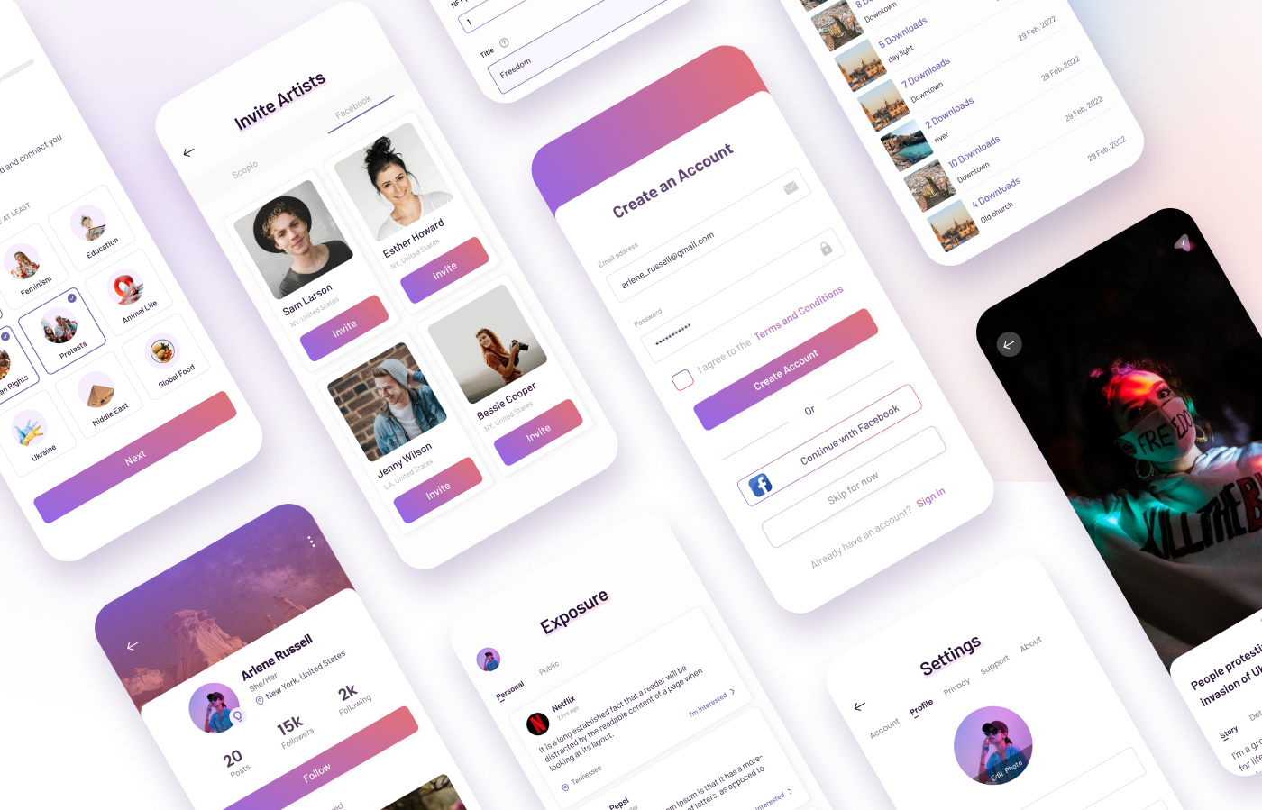
Scroll through and read about the different sections of the app before signing up. This also includes selecting relevant interests and following other artists.
Discover
Discover images and stories by other artists and follow them. Our machine learning based algorithm feeds images and collections based on the artist’s interests, artists they follow, and their activity.
UI Components
Image Upload
Upload and submit images and stories, and sell them regularly or as NFTs. We improved our proprietary AI system to curate images on the backend and notify the artist in record time about the status of their image.
Profile
Details about the artist such as bio, location, ethnicity, gender, artistic/photographic style, interests, skills. This is optional to include and helps us send the artist relevant opportunities as well as curate their feed with relevant content.
Opportunities
Discover opportunities from companies Scopio partners with, based on the artists’ skill levels and backgrounds.
Statistics
View analytics like number of images published, downloads, views, saves, earnings, and followers.
Notifications
Get notifications about image updates, analytics, follows, and new opportunities.
The Launch
Together with the engineering team, I broke up the release of each feature of the app in several sprints. We rolled out each phase to the rest of our team for user testing and feedback. After the team and I trouble shot bugs and fixed design issues, we released the app to the public on the Apple Store and Google Play. We got great feedback from our artist community and grew our user base by 18% in the first 3 months of its release.
User Engagement Metrics
I set up user engagement analytics with the engineering team for the app. After its launched, I was able to tack metrics like logins, photos submitted, model releases submitted, top features engaged with, photos reviewed and published, and many other important insights. It allowed the team to continuously iterate on app improvements and address glitches and quantitative feedback in real-time.
User Feedback & Insights
I continued to user test the app, and discuss with my team future improvements to include in the product roadmap. I surveyed 20 users to get quantitative and qualitative feedback. In addition, I led the creation of engagement metrics on Google analytics, so we’re able to have real-time insights on the performance of the app.
Continuous Improvements
Based on the rich feedback and insights we got from users, I took note of future improvements to be included in the app’s product roadmap.


